


Stephen Withrow interview with Bryan Talbot
This interview was with Steven Withrow in 2006 and was conducted as part of his research for the book Character Design for Graphic Novels, of which Bryan wrote the introduction.
1. Who/what are your major influences/sources of inspiration in terms of character creation/design? Do you draw from life?
B: Stories and scenes can be constructed, worked on but. To me, character tends to be the area of storytelling which is the most intuitive. They have to sound real to me (in their own context, of course) and usually their character comes, almost fully formed, once I know the role they have to play, their function.
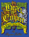
Occasionally, if it works, I’ll base a character on someone I know. Sam in Bad Rat, for example, was completely based on a friend. Sometimes, (but infrequently) I’ll incorporate elements of a movie or TV character into one of mine. The best example of this is Harry Fairfax in Heart of Empire, some of whose mannerisms I based on those of Wilfred Bramble’s ‘Old Steptoe” character in the British 1960s TV series Steptoe and Son.
2. Does the visual design of a character precede the formation of the character's personality, the other way around, or is it more of a simultaneous experience?
B: Yes, they tend to develop simultaneously, as do the novels themselves. They are a visual medium, so the story evolves alongside the visuals. My first version of the script is always in the form of thumbnail sketches and dialogue/text notes.
3. The graphic novelist Eddie Campbell says he detests the term "character design" -- avoiding model sheets and character sketches and preferring to discover the character in the process of storytelling, finding and evolving the character right on what will become the finished page. Do you work similarly? What is your basic "process" in this regard?
B: Yes, I agree with him. I don’t do “character sheets” for my own books (though I’ve did them once commercially for a comic company). I tend to do a few sketches to develop the character’s appearance. I think the biggest difference between Eddie’s and my approach is that he means it literally – developing the character as the story unfolds – as he draws it page by page. For a graphic novel, I always spend a great deal of time on the structure of the whole before I draw a single page. This is the point at which, to me, the characters really come into focus.
4. What is your definition of "graphic novel"? Do you feel your books fit that description?
B: I think so. A graphic novels has to be structured as a novel, as a whole with a beginning, middle and end, with its own themes and concepts unique to that book and not just as an episodic series of strips that’s been thrown together to make a book.
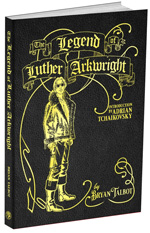
5. Could you talk a little about the choices you made in the design of Luther Arkwright, and how and why this is an effective design for the story you're telling? How much research or gut instinct informed your choices?
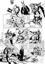
B: Arkwright, though basically SF in essence, is a cross-genre story which also includes elements of horror, espionage and historical fiction, so I didn’t want a Star Wars/Buck Rodgers atmosphere. I loosely based the inking style on the engravings of William Hogarth, the 18th century illustrator and painter who was the father of both British Art and the British comic strip, to give the book a sort of historical patina, though I did vary the style for different sections to give each an individual feel. The storytelling was another matter and was deliberately experimental, drawing in a lot of influences from then contemporary cinema (including Nic Roeg, Peckinpah, Copolla and Sergio Leone).
With Luther Arkwright being, in the story, the next stage of human evolution, I wanted him to look semi-divine, angelic, as to us, I expect, they’d have the aura of demigods. The white hair was part of this, to make him appear slightly alien, to have some sort of purity. The centre parting, I confidently decided at the time, was to denote equilibrium but, looking back, I think it was lifted from David Bowie in The Man Who Fell To Earth. Bowie was a big influence on the look of Arkwright. At a time when all comic heroes where muscle-bound and macho, I wanted Arkwright to be slender and androgynous. I suppose that my choices were given the all clear by gut reaction but only after I’d considered them thoroughly.
6. Could you do the same for Helen from Tale of One Bad Rat -- and possibly also Alice from the new "Sunderland" book (which looks captivating, by the
way)?
B: Yes, I though long and hard about both before beginning. The choice of style for both was very deliberate. In the case of Bad Rat its job was to be easily accessible to readers with no acquired knowledge of comic grammar, to be very clear and straightforward. That’s why I used a clear line technique and based all the pages around the 9 panel grid and had no “cutting away” from the main character. The look of Helen was based on a girl I’d seen begging on Tottenham Court tube station. Bad Rat is the only book I’ve done where I “cast” the whole story and used photo ref for all the main characters. This meant that I had to find someone for the role of Helen who looked like my character sketches and was very lucky to find Kate Housden, a 16 year old drama student at the time and a great little actor.
Alice in Sunderland is a very different kettle of fish and is not a story as such – it’s a documentary within which a multitude of short stories are told. Although I do tell of the life of Alice Liddell (the “real” Alice), it’s told from a distance, narrated by a third party, so she doesn’t have a speaking part and her look is totally based on photos of Alice Liddell.
7. Do you strive for consistency from panel to panel, page to page, book to book, or are your characters more fluid in appearance? By extension, how do you
know when you‚ve got the character down visually; when does the revision and refining end?
B: It’s important that the character is recognisable from most angles and from a distance. Getting a character that’s produced purely by imagination (as opposed to one based on a real person) that looks consistent and has its own distinct mannerisms is a real skill. The first comics I produced for print, my underground work which was my apprenticeship in the medium, featured my first protagonist, Chester P. Hackenbush. I gave him a beard, round glasses and a straight nose precisely because it was an easy way of making him immediately recognisable, even at a far distance.
When I work on a comic story – either for a short, 22 page comicbook or a graphic novel – I usually pencil the whole thing and then go back and do the inks. This gives me enough time to get used to the characters so that I can make any changes at the inking stage. This is also good for getting the continuity right – if I introduce an element into a scene later on, I can place it into earlier scenes, if appropriate, retrospectively.
Alice in Sunderland, again, is very different. The whole idea behind the book is that things are changing all the time and the characters are fluid in appearance. Different styles come and go. The two main characters’ faces, though always recognisable, change drastically throughout the book.
8. How much conscious thought do you put into the physical behaviors -- posture, gesture, style of movement -- of your characters? From what I've seen, your characters are superb "actors" and get as much, if not more, across in pantomime as they do in dialogue.
B: I put a lot of thought into it. Body language and facial expression are very important storytelling tools and each character should be fluent – as much as possible, each pose should emphasise what you’re trying to put across in the story. As for pantomime, yes, it should be possible to follow the story or perceive the situation just going from the visuals. I don’t read superhero comics very often but was very surprised leafing through a few recently to see how little regard the artists seemed to have for the storytelling. One hero had only two expressions throughout the comic – mouth shut tight or with clenched teeth. In another, one character was telling a joke and the other was laughing – but the characters were about fifteen feet apart, staring out of windows in opposite directions and neither had their mouth open or were even smiling! I usually always try and have a character’s mouth open when they are talking, in a way that expresses what they are saying, and very often reinforce this with their hand or head gestures or body position. I have a mirror attached to the drawing board for this purpose – to pose for the characters. One comic I saw had a really long scene of a heated conversation and in every single panel the characters’ mouths were firmly clamped shut!
Stephen's book Character Design for Graphic Novels is available from Amazon now.