


Grandville afterword
This afterword was done specially for the French edition of Grandville to be published by Bragelonne/Milady mid-February and is exclusively available in English here on the site.
 I hope that you enjoyed your visit to the world of Grandville. I certainly enjoyed creating it, so much so that I’m currently working on another Detective Inspector LeBrock adventure and have ideas for three more stories. In over thirty years of writing and drawing comics I’ve never produced a series of albums before, usually preferring to experiment with different styles and types of story, but I had so much pleasure being in Grandville that I want to stay here for a while if possible.
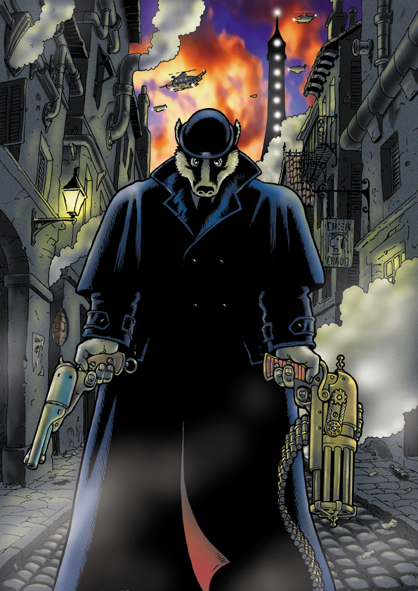
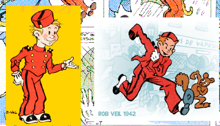
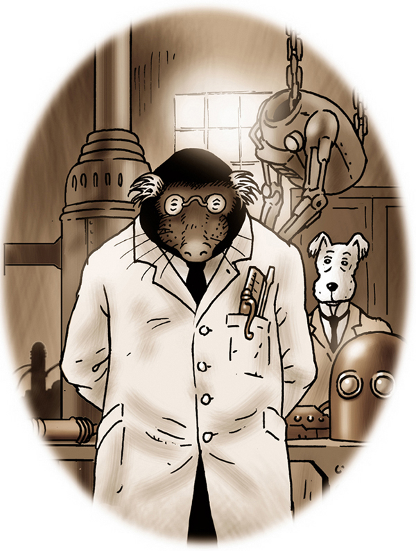
This is the very first illustration I did of LeBrock. It accompanied the proposal that I sent out to prospective publishers to show them the style in which it would be illustrated.

 Editor Claire Deslandes and the good folk at Bragelonne, keen to give added value to their readers, have asked me to write this afterword exclusively for the French edition of the book. It seems to me that it’s a good opportunity to show you where I’m coming from and point out some things you perhaps might otherwise have missed. It doesn’t matter if you did miss them – they don’t affect the story at all - but some may amuse or interest you.
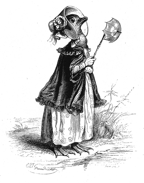
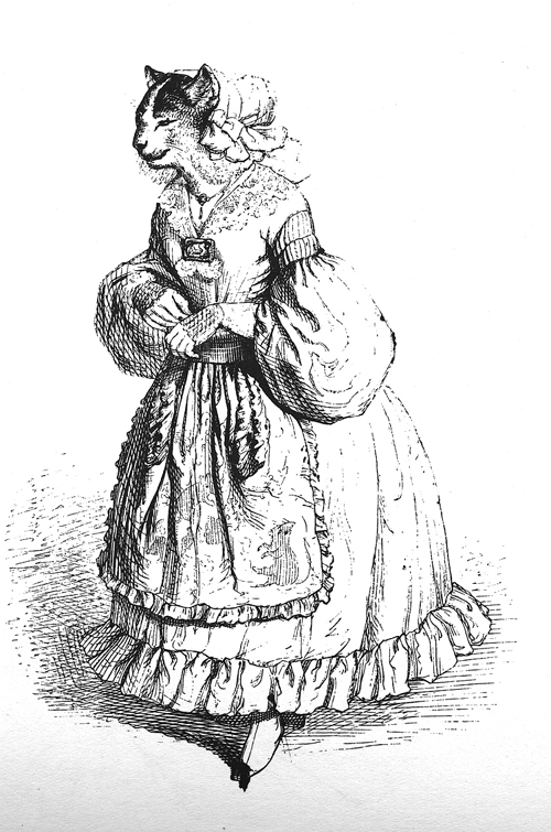
As I mention on the credits page, the initial inspiration for the story was the anthropomorphic illustrations of the early nineteenth century French cartoonist Jean Ignace Isadore Gérard. About two years ago I was looking at a book of his work that I’ve owned for years and suddenly his animal characters came together with his nom de plume, JJ Grandville, sparking an idea of a steampunk Paris, populated by animal headed characters. The story then seemed to write itself.
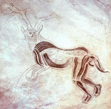
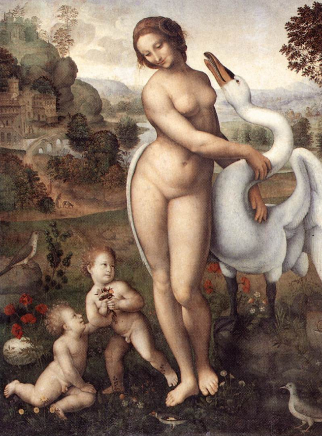 Of course, the anthropomorphic tradition stretches back into prehistory, a good example being the Trois Freres cave painting that shows an antler-headed and animal-eared man with a tail.
 The old mythologies and religions are filled with anthropomorphic characters, as are the folk tales and fables passed down from generation to generation.
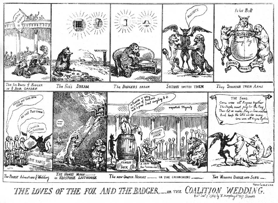 They even appear in the first printed comic strips. Here, look at this. The Loves of the Fox and the Badger is a satirical broadsheet, a piece of English political propaganda, drawn by Thomas Rowlandson in 1782, criticising the alliance of the leaders of the two opposing ruling parties. It has all the elements of a modern comic: sequential panels, speech balloons and even thought images.

 The anthropomorphic tradition runs strongly through British and French comics and book illustration from then till the present day. A contemporary of Gérard in England was Randolph Caldecott who illustrated many nursery rhymes and who was a big influence on the later Beatrix Potter’s animal character illustrations. A French contemporary of Potter’s was Benjamin Rabier, whose comics influenced Calvo and Hergé and whose picture of La Vache Qui Rit is still famous.
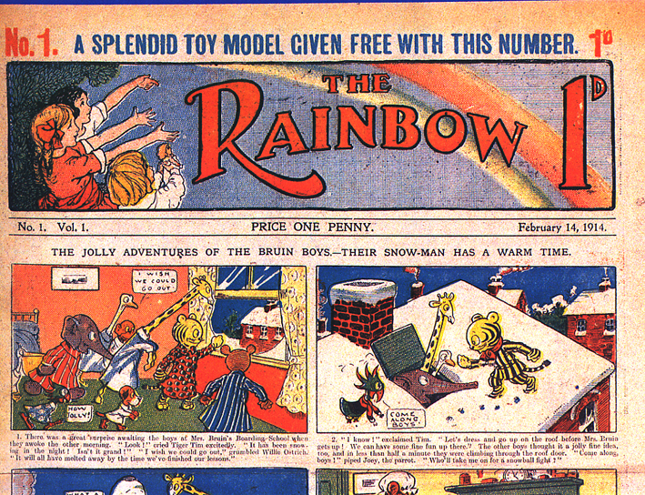
Animal characters, such as Tiger Tim were very common in British weekly children’s comics from their inception in 1890.
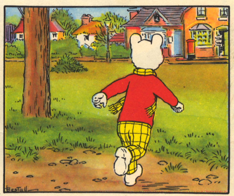 I grew up reading these comics in the 1950s, especially Rupert the Bear, a character famous in Britain but whose comics are virtually unknown outside the Commonwealth. Similar to Tintin, the strip, written and drawn by Alfred E Bestall, used cartoon characters against realistically rendered backgrounds in a ligne claire style and coloured in watercolour. Until I was ten years old, my Christmas present from my father every year was the Rupert the Bear annual album.
 The murder of Raymond Leigh-Otter near the beginning of Grandville was in Rupert Bear’s village, Nutwood. On page eleven, Rupert’s house is just across the road from his. On page fifteen you can see Rupert’s dad trimming the hedge in the background. On page sixteen you can almost read the railway station sign bearing the name of the village.
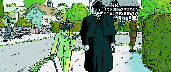
There are several visual references like this throughout the book. I imagine French readers spotted the homages to Becassine, the first ongoing French comic character and probably the first female comic protagonist, Spiro and Herge. You might not have noticed one like this:
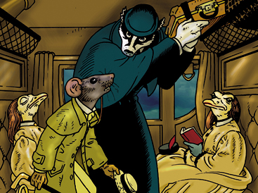
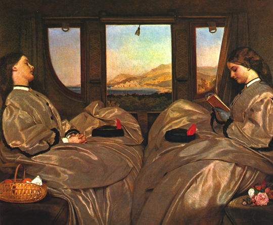 It’s a reference to The Travelling Companions by the Victorian English painter Augustus Egg.
You probably did recognise that panel four on page twenty-two was a parody of The Bar at the Folies Berger by Edouard Manet.
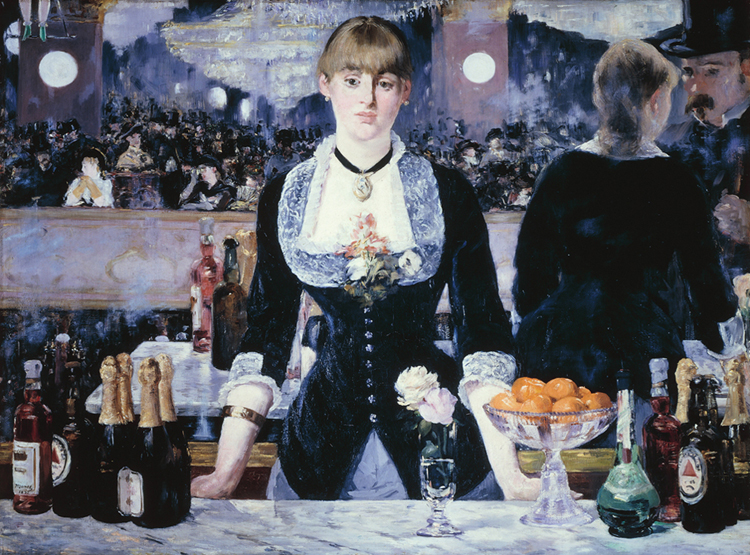
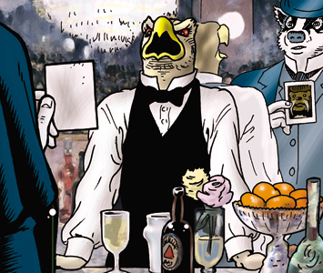 LeBrock asks for a bottle of Bass, an English beer. Bass was actually sold at the Folies Berger and you can see two bottles of it on the counter (the ones with the small red triangles). You may notice that I had to correct the perspective on my version because it would have looked strange if I’d kept to Manet’s. Manet painted the reflection deliberately wrong to achieve a certain effect. It wouldn’t have worked in the comic.
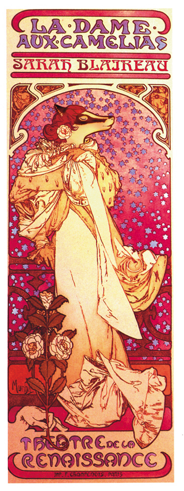
 Also on page twenty-two is a reworking of an Alphonse Mucha poster of Sarah Bernhardt…
…and a Reed Waller poster of the American erotic comic character originally written by Kate Worely, Omaha the Cat Dancer. I once did an illustration for an Omaha benefit book to raise money for Reed’s hospital treatment when he had cancer.
I was very embarrassed when it appeared in print. I’d forgotten to draw her tail!
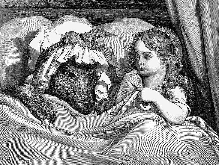
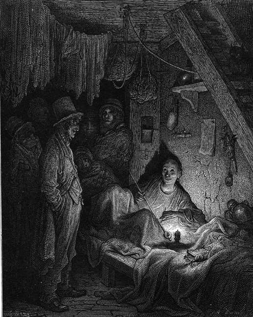 The scene in the opium den (on “Rue Dorée”) on page fifty-six was a reference to Gustave Doré’s famous illustration from London: a Pilgrimage.
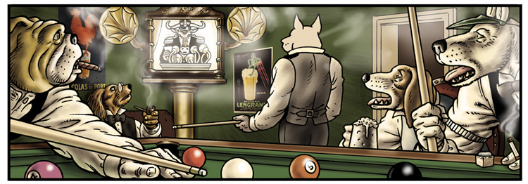
 Panel two on page ninety-seven is a reference to the pool-playing dogs of Arthur Sarnoff (1912 – 2000) whose paintings of the dog characters portrayed there were the best-selling prints in the 1950s in the UK and the USA and can still be seen framed on the walls in some English pubs today.
The anthropomorphic tradition as a genre in comics is as strong today as ever, with titles such as Usagi Yojimbo, Stan Sakai’s rabbit samurai, published monthly since 1984, Canales and Guardino’s Chandleresque panther private detective Blacksad stalking a1950s film noire America, Starkings and Ladron’s hard boiled hippopotamus private dick of the future, Hip Flask and the recent fantasy series Mouseguard by David Peterson all being very popular in the UK and USA.
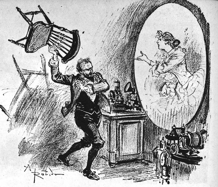
 After Jean Gérard another influence on Grandville was Albert Robida. Robida was a visionary. He was the first real science fiction artist, his illustrations predicting everything from germ warfare, through metal flying machines to mass corporate pollution. Here he depicts a video telephone.
 There are a few illustrations in the book that I created separately from the comic and dropped them in on computer, such as the Sarah Blairow poster I’ve mentioned already, which you might like to see a little larger. Here are some of them.
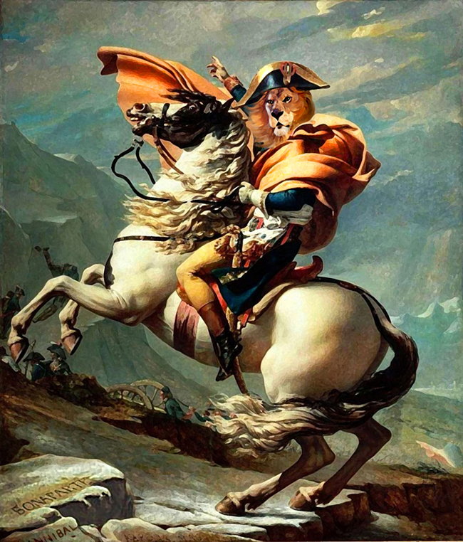 This is based on Napoleon Crossing the Alps painted by Jacques-Louis David.
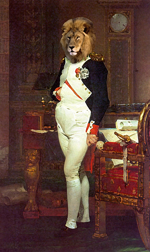 Napoleon again, this time based on another David painting of the Emperor in his study.
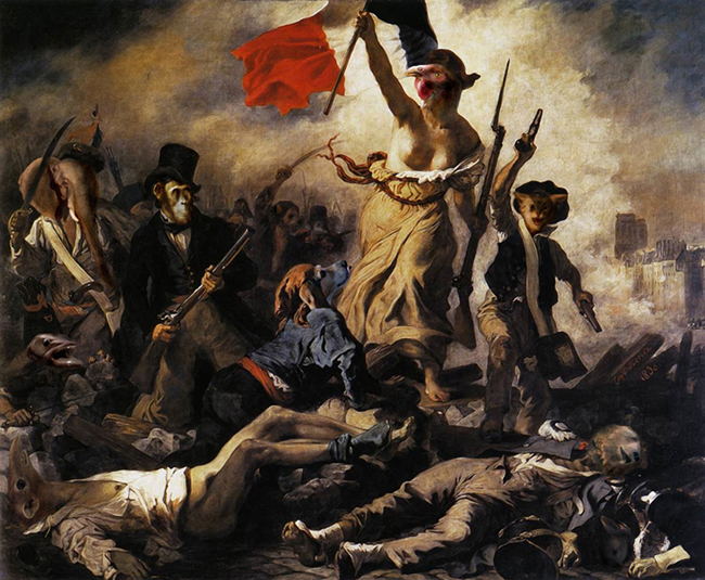
 These aren’t the only world-famous paintings pastiched in Grandville. All French readers will have noticed the reworking of La Liberté Guidant le Peuple by Eugène Delacroix. As a cock is the symbol of France, I portrayed Marianne (the personification of France) a chicken in this picture, as well as on the statue of her fronting the hotel bearing her name on page nineteen..
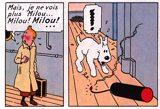
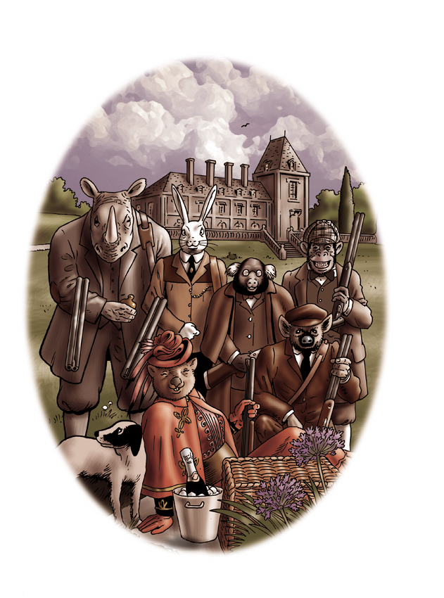 Here are a couple of the photographs in the story – Professor Tope with Milou and the Knights’s hunting party.
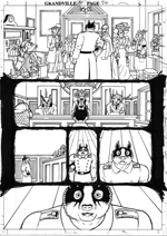
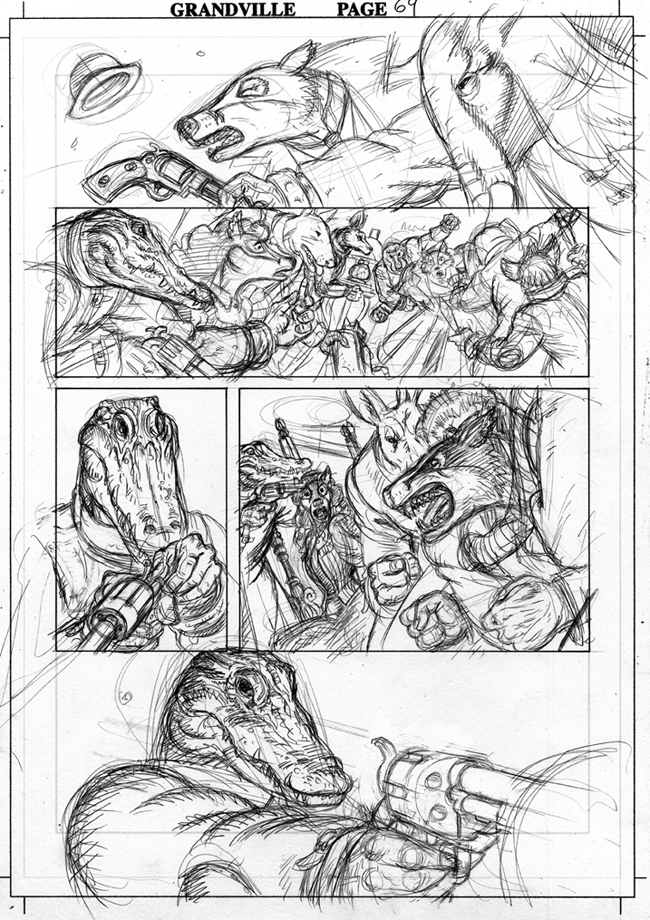 Although the vast majority of the artwork in the book is created traditionally, it is coloured and finished on computer using Photoshop. Let’s look at a sample page – actually the only page that I scanned the pencils for, for a comics fanzine. Here’s the drawing, done with a pencil on a drawing board, for page sixty-nine.
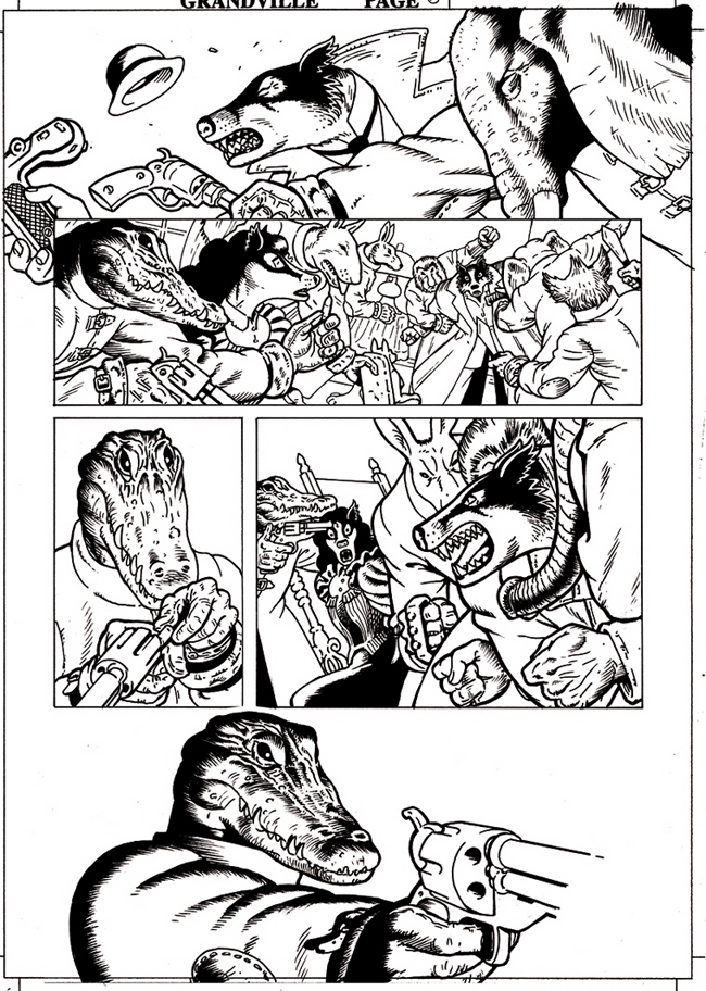 This was then inked, using a brush and technical pens and the pencil lines were removed with an eraser. This is the point when I scanned the page into the computer and cleaned up any unwanted marks and made any corrections to the linework using the Photoshop eraser and brush tools.
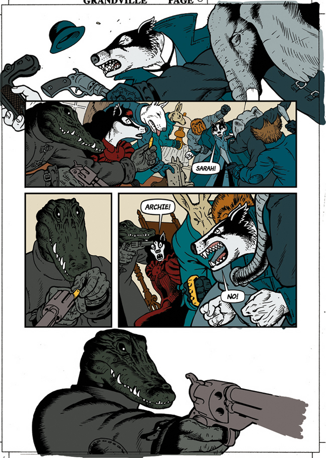 Next came the colour flats: the different areas of the illustrations were selected and filled with different solid colours on a layer beneath the linework. About three quarters of the colour flats in the book were done by my friend, the designer Jordan Smith, something that saved me quite a bit of time. You can see that I’ve also added the final panel borders using the line tool and the text and speech balloons, both on separate layers above the ink line layer.
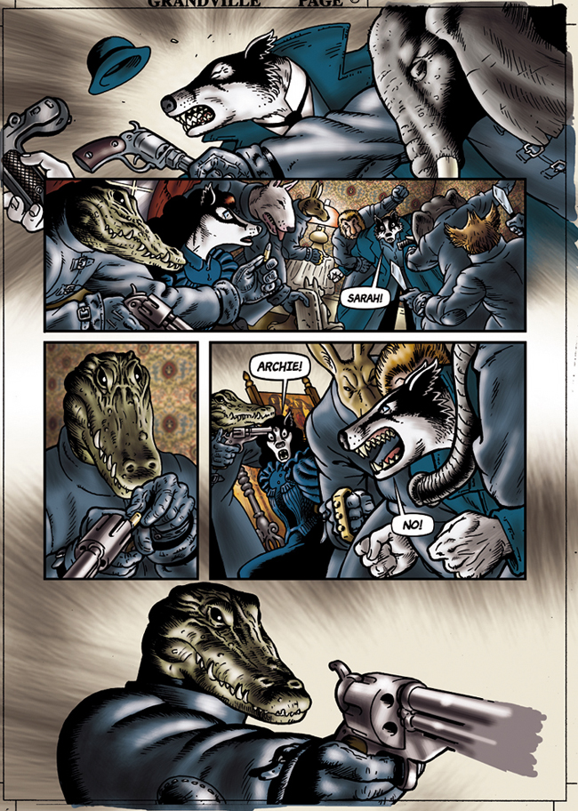 Then I could select each area easily using the magic wand tool, adjust the colours and render them in a way that’s very similar to painting, mainly using the dodge and burn tools and the airbrush to create the light and shade and texture. I also dropped in the wallpaper and screen designs in the backgrounds of panels two, three and four.
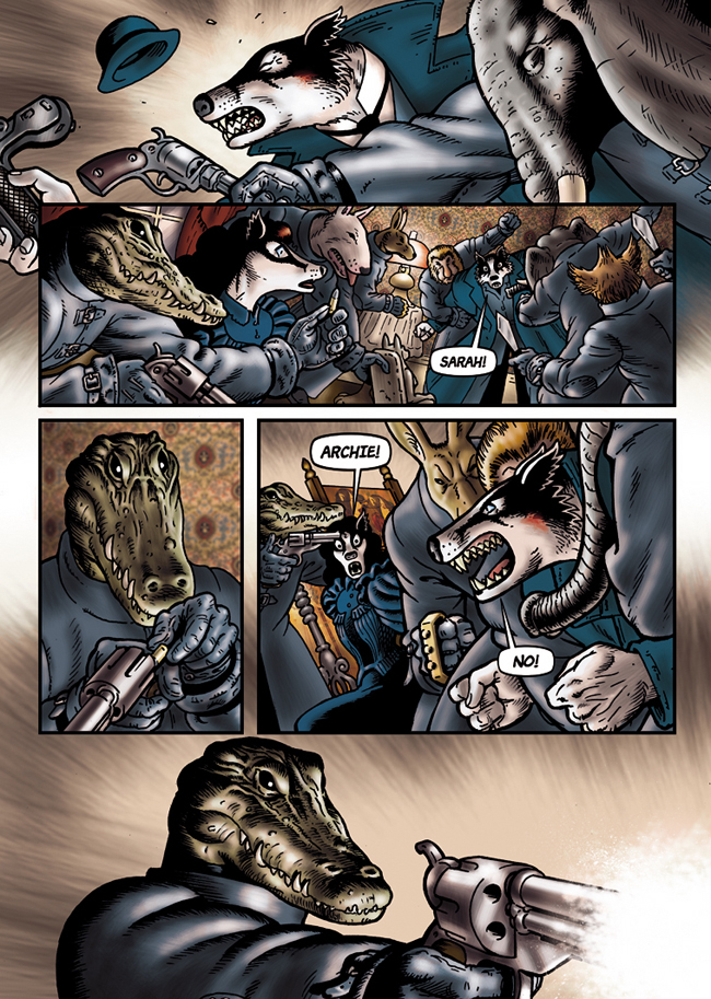 And this is the finished page. I added a pale red tint on a multiply layer, as I did on all the pages in this apartment scene, to give it its own atmosphere, adding highlights by rubbing out parts of the layer with the eraser tool. I then added the gun flash on a layer above the rest using a mixture of the airbrush tool and some scanned-in ink splatter, reversed from black to white. The overlap, or “bleed” around the sides, to prevent a white line appearing if it is printed slightly off centre disappears in the printing process, cropping the artwork to fill the page.
I mentioned at the beginning of this afterword that I’m now working on a second Detective Inspector LeBrock book. Grandville Mon Amour is set three weeks after the events in this first book and concerns LeBrock's hunt for an insane serial killer, an old adversary and deadly urban guerrilla. It’s all penciled and lettered and I’m working on the inks right now. I hope you’ll be here for the ride.
Bryan Talbot
Sunderland, England
December 2009
Also see the interview with Bryan by a French website: translated into English though.